The Knot Worldwide
AI Style Quiz — Personalized Vendor Discovery
A quiz built to help couples was suppressing engagement instead. Two sequential A/B tests — UI first, AI second — with two part-time engineers.
- Role
- Lead Product Designer
- Timeline
- Two sequential A/B experiments over ~4 months
- Team
- Product Manager, Data Scientist, UX Researcher, Engineering Lead, 2 Front-end Engineers
- Tools
- Figma, User Testing, Jira, Confluence, Miro
+17%
high-value actions · phase 1
+7.9%
high-value actions · phase 2
−40%
time to complete
Impact:
- Phase 1 — UI: +17% High-Value Actions · +10.8% lead submissions
- Phase 2 — AI: +7.9% High-Value Actions · +5.6% marketplace lead CVR
- Time to complete: −40%
For three years I led design for the top of the funnel of the #1 US wedding marketplace — 16M annual visitors, 200,000+ vendors: the surfaces where newly engaged couples arrive, discover what they want, and decide whether to sign up. The Style Quiz is the piece in that scope with the most measured impact — and when I picked it up, it was doing the opposite of what it was built for.
The Challenge
The Knot is the #1 US wedding marketplace, generating revenue by connecting couples with vendors. The Style Quiz was designed to help overwhelmed couples discover their aesthetic — but it was suppressing engagement instead of boosting it.
35% abandoned mid-quiz. Completers engaged 40% less with vendors than direct sign-ups. The quiz was hurting, not helping.
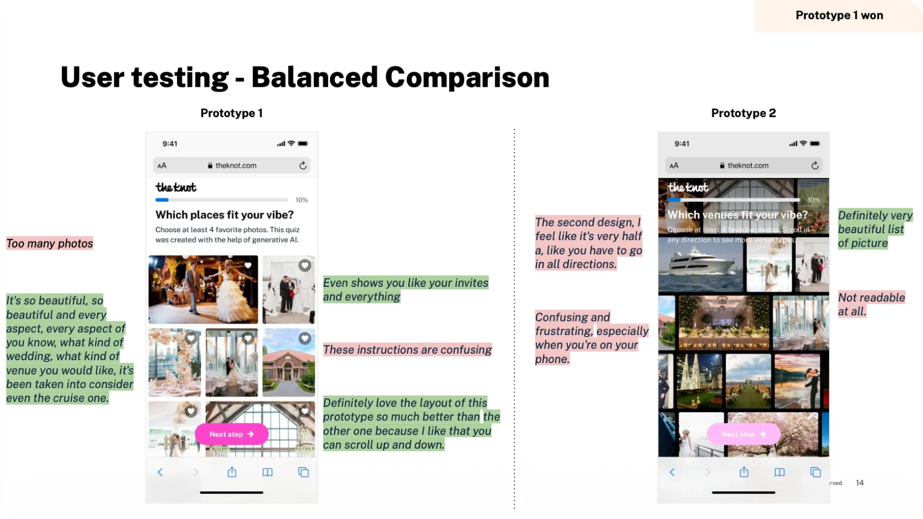
Research with 20+ users revealed why: too many images (30+ per category), confusing like/dislike interactions on mobile, and results that felt generic and irrelevant.
Key Constraints
- Can’t break what works — the quiz already generated sign-ups. Solution: two-phase A/B testing to isolate UI from AI improvements.
- 2 engineers part-time — shipped Phase 1 (UI only) in 6 weeks, layered AI in Phase 2 once UI was proven.
- 70% mobile traffic — the old design was optimized for desktop. Prototyped vertical grids, tested with 8 mobile users before building.
- AI explainability — stakeholders worried about “black box” recommendations. Designed results with match scores and clear reasoning.
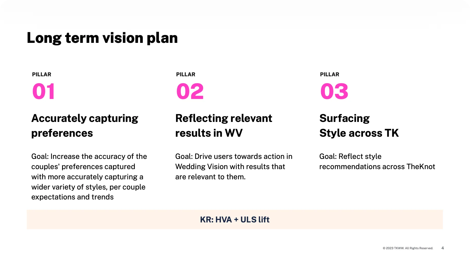
Approach & Decisions
Key decision: two sequential phases. Phase 1 modernizes the UI without AI. Phase 2 layers the personalization on top. Two A/B tests in a row, not one: it isolates the variables, takes risk out, and delivers value at each step. With two part-time engineers it was also the only way to ship anything in six weeks.
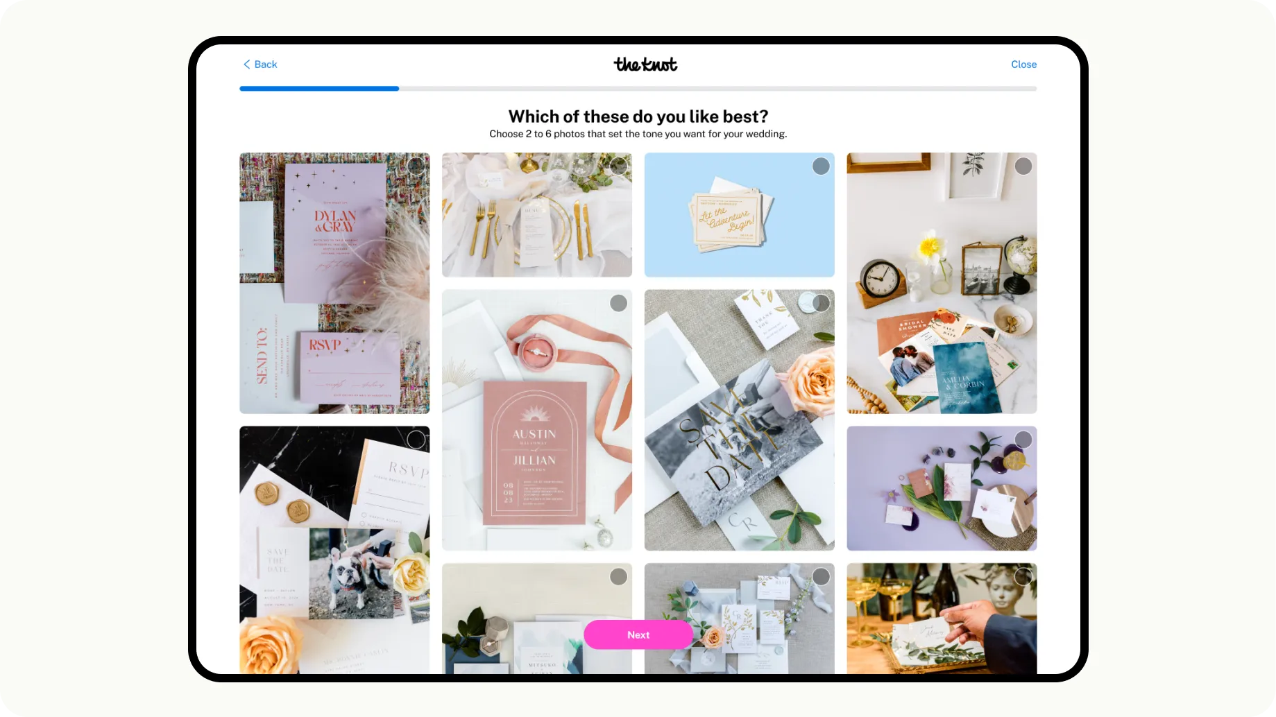
Phase 1 — UI Modernization. Replaced “like/dislike” with “select 2-6 favorites.” Vertical scrolling grid on mobile (tested vs. carousel — vertical won). Modernized hierarchy and navigation.
Phase 1 results: A/B test → +17% High-Value Actions, +10.8% lead submissions. The UI work alone validated the approach.
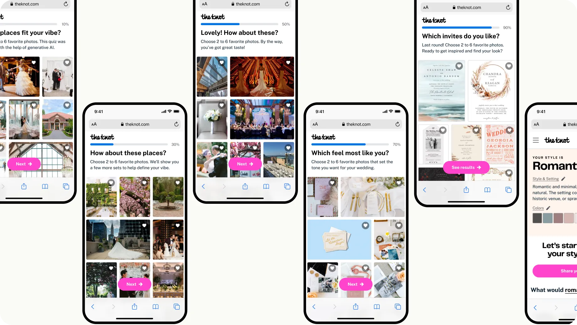
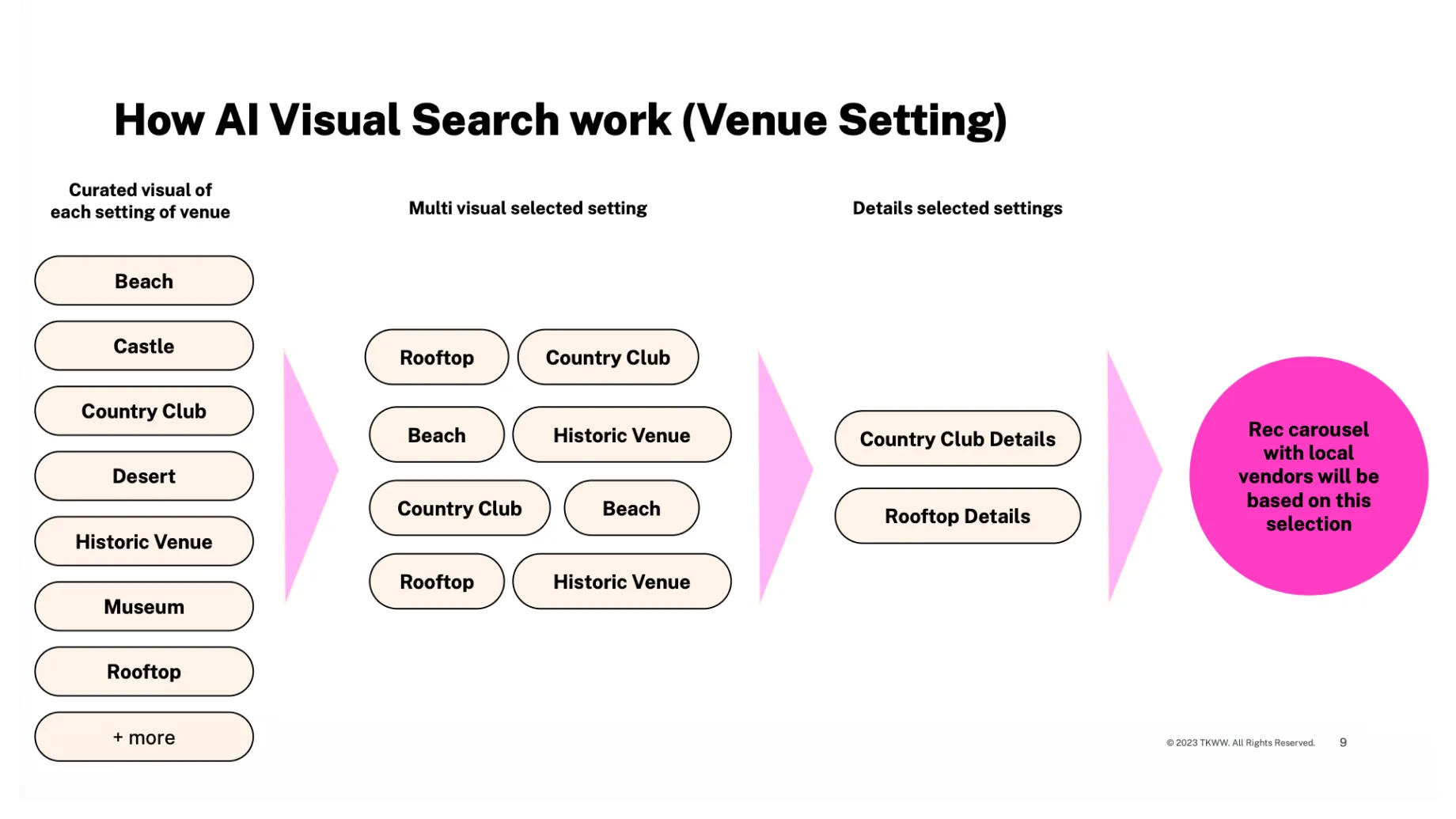
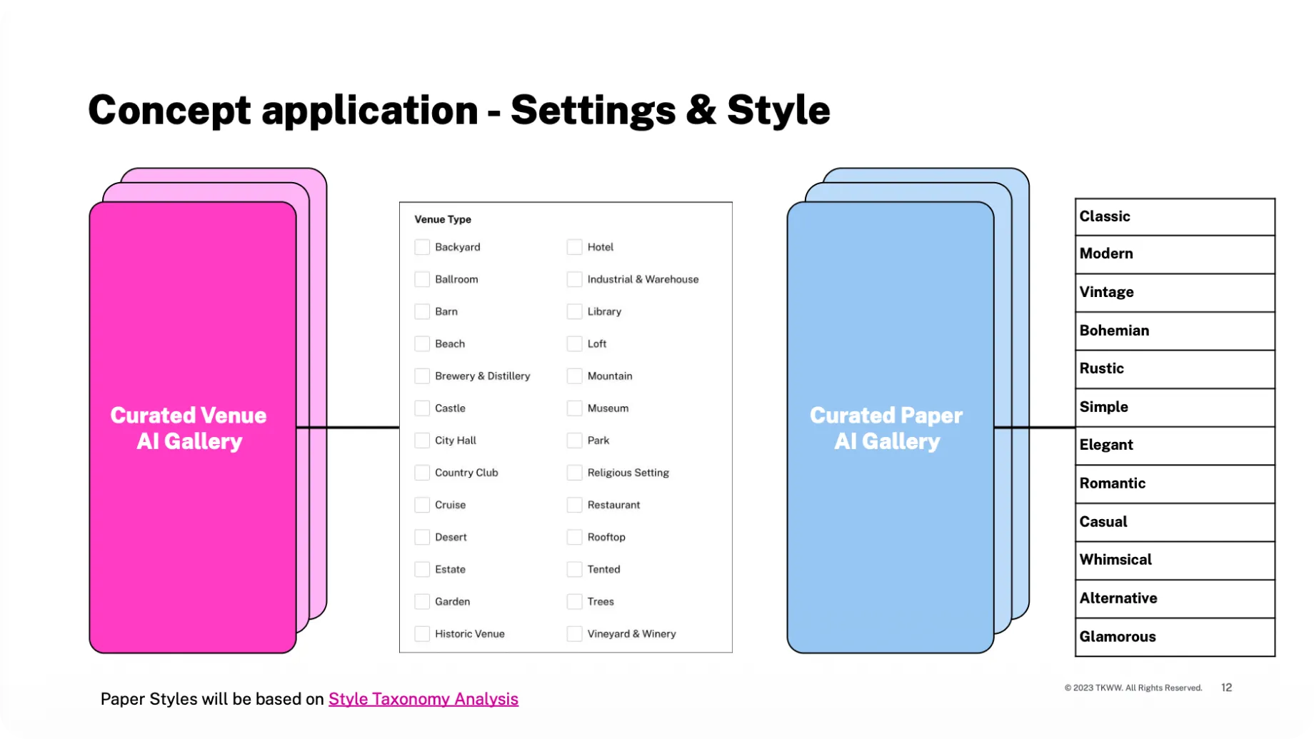
Phase 2 — AI personalization. Working with data science, I designed a system where each selection informs the images that follow, with match scores and visible reasoning on the results — the internal fear was the black box.
Phase 2 results: A/B test → +7.9% lift in HVA, +5.6% increase in marketplace lead CVR
The Solution
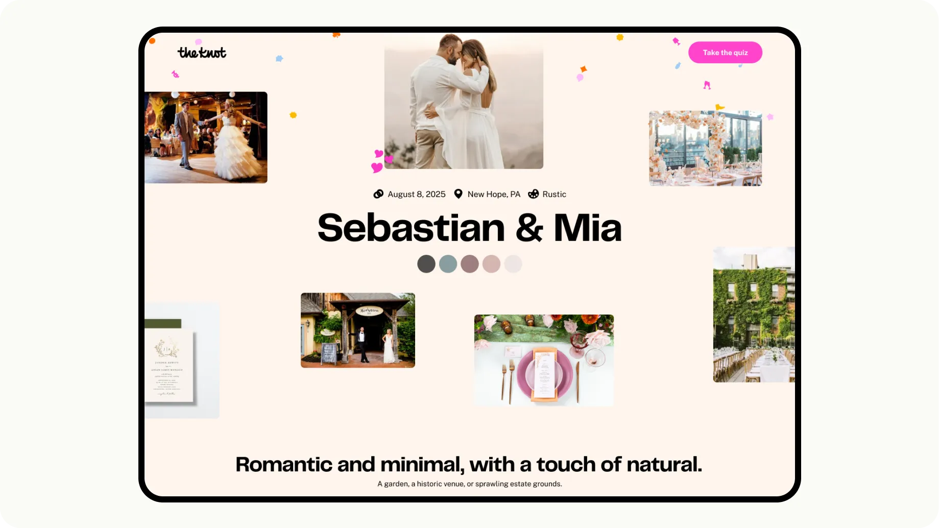
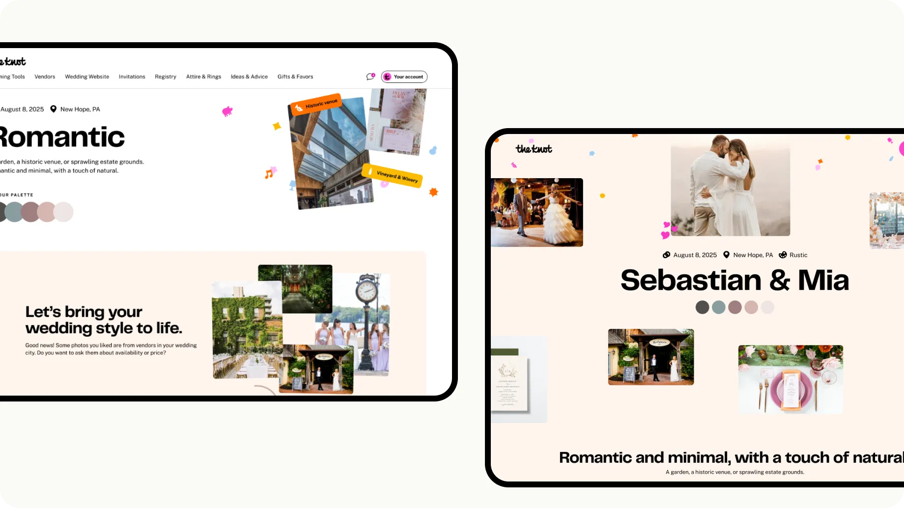
Couples select favorites, the system learns their taste as they go, and the results page returns matched vendors with a match score, a style summary, a color palette and curated inspiration.
The results page went from generic output to a discovery tool: it connects a style preference to the vendor recommendations that the marketplace actually monetizes.
Results
Phase 1 — UI: +17% High-Value Actions · +10.8% lead submissions Phase 2 — AI: +7.9% High-Value Actions · +5.6% marketplace lead CVR Both phases: 40% reduction in time to complete
“It feels so personalized!” — “The venues were PERFECT for my style” — “Every aspect has been considered”
What I Learned
- Sequential experiments de-risk complexity — two phases let us ship faster, isolate variables, and build internal confidence.
- Invisible AI wins — the interface never says “AI.” Users just see increasingly relevant options.
- Mobile-first forces better decisions — the vertical grid that won on mobile made the desktop experience cleaner too.